반응형
세팅
1. 파일과 폴더
수험번호 폴더 — images, css, js 폴더 생성, index.html 생성
- images 폴더 : 이미지 10개
- css 폴더 : common.css 파일 생성
- js 폴더 : jquery파일 이동, common.js 파일 생성
2. HTML
<!DOCTYPE html>
<html>
<head>
    <meta charset="UTF-8">
    <title>강원천문대</title>
    <link rel="stylesheet" href="css/common.css">
    <script src="js/jquery-1.12.3.js"></script>
    <script src="js/common.js"></script>
</head>
<body>
    <header></header>
    <section></section>
    <footer></footer>
</body>
</html>
3. CSS
* {
    padding: 0; margin: 0;
    font-family: "맑은 고딕", sans-serif;
    font-size: 14px; color: #333333;
}
li {list-style: none;}
a {text-decoration: none;}
img {border: none;}

header {
    width: 1200px; height: 100px; margin: 0 auto;
}
section {
    width: 1200px; height: 500px; margin: 0 auto;
}
footer {
    width: 1200px; height: 100px; margin: 0 auto;
}
레이아웃
1. HTML
<body>
    <header>
        <h1></h1>
        <nav class="hNav"></nav>
    </header>
    <section>
        <div class="slide"></div>
        <div class="board"></div>
        <div class="banner"></div>
        <div class="shortcut"></div>
    </section>
    <footer>
        <h1></h1>
        <nav class="fNav"></nav>
        <p></p>
    </footer>
</body>
2. CSS
header h1 {
    float: left;
    width: 250px; height 100px;
}
.hNav {
    float: right;
    width: 600px; height: 40px;
    margin-top: 30px;
}
.slide {
    width: 1200px; height: 300px;
}
.board {
    float: left;
    width: 400px; height: 200px;
}
.banner {
    float: left;
    width: 400px; height: 200px;
}
.shortcut {
    float: left;
    width: 400px; height: 200px;
}
footer h1 {
    float: left;
    width: 250px; height 100px;
}
.fNav {
    float: left;
    width: 950px; height: 50px;
}
footer p {
    float: left;
    width: 950px; height: 50px;
}
로고, 푸터 메뉴, 카피라이트
1. HTML
<body>
    <header>
        <h1>
            <a href="#">
                <img src="images/logo_top.png" alt="logo">
            </a>
        </h1>
        <nav class="hNav"></nav>
    </header>
    <section>
        ...
    </section>
    <footer>
        <h1>
            <a href="#">
                <img src="images/logo_bottom.png" alt="logo">
            </a>
        </h1>
        <nav class="fNav">
            <ul>
                <li><a href="#">개인정보처리방침</a></li>
                <li><a href="#">저작권정책</a></li>
                <li class="last"><a href="#">RSS</a></li>
            </ul>
        </nav>
        <p> Copyright ⓒ Kangwon. All right reserved. </p>
    </footer>
</body>
2. CSS
.fNav {
    float: left;
    width: 950px; height: 50px;
    line-height: 50px; text-align: center;
}
.fNav li {
    display: inline-block;
    padding-right: 10px;
}
.fNav li:after {
    content: '|';
    position: relative;
    left: 7px; top: -2px;
}
.fNav .last { padding-right: 0; }
.fNav .last:after { content: ""; }
footer p {
    float: left;
    width: 950px; height: 50px;
    line-height: 50px; text-align: center;
}
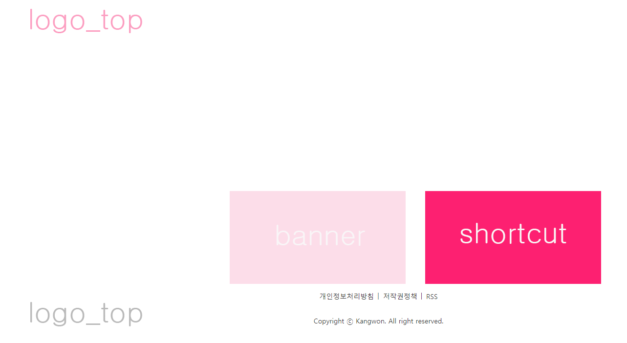
배너, 바로가기
1. HTML
<section>
        <div class="slide"></div>
        <div class="board"></div>
        <div class="banner">
            <a href="#">
                <img src="images/banner.png" alt="배너">
            </a>
        </div>
        <div class="shortcut">
            <a href="#">
                <img src="images/shortcut.png" alt="바로가기">
            </a>
        </div>
 </section>
2. CSS
.banner {
    float: left;
    width: 400px; height: 200px;
    padding: 10px 20px 0;
    box-sizing: border-box;
}
.shortcut {
    float: left;
    width: 400px; height: 200px;
    padding: 10px 20px 0;
    box-sizing: border-box;
}
메뉴
1. HTML
<header>
        <h1>
            ...
        </h1>
        <nav class="hNav">
            <ul>
                <li>
                    <a href="#" class="mainNav">강원천문대</a>
                    <ul class="subNav">
                        <li><a href="#">천문대소개</a></li>
                        <li><a href="#">인사말</a></li>
                        <li><a href="#">오시는길</a></li>
                    </ul>
                </li>
                <li>
                    <a href="#" class="mainNav">이용안내</a>
                    <ul class="subNav">
                        <li><a href="#">프로그램</a></li>
                        <li><a href="#">관람시간표</a></li>
                        <li><a href="#">이달의 별자리</a></li>
                    </ul>
                </li>
                <li>
                    <a href="#" class="mainNav">천문대예약</a>
                    <ul class="subNav">
                        <li><a href="#">예약하기</a></li>
                        <li><a href="#">예약확인</a></li>
                        <li><a href="#">예약취소</a></li>
                    </ul>
                </li>
                <li>
                    <a href="#" class="mainNav">커뮤니티</a>
                    <ul class="subNav">
                        <li><a href="#">공지사항</a></li>
                        <li><a href="#">방문후기</a></li>
                        <li><a href="#">자유게시판</a></li>
                    </ul>
                </li>
            </ul>
        </nav>
  </header>
2. CSS
.hNav > ul > li {
    float: left;
    width: 150px; height: 40px;
    text-align: center; line-height: 40px;
    position: relative;
}
.hNav > ul > li:hover .mainNav {
    background-color: #0066ad; color: #fff;
}
.mainNav {
    display: block; width: 100%; height: 100%;
    font-size: 18px; font-weight: bold;
}
.subNav {
    position: absolute; top: 40px;
    z-index: 5000;
    width: 100%; height: 120px;
    background-color: #fff;
}
.subNav li {
    width: 100%; height: 40px;
    text-align: center; line-height: 40px;
}
.subNav li a {
    display: block;
    width: 100%; height: 100%;
    font-size: 14px;
}
.subNav li a:hover {
    background-color: #30a3f3; color: #fff;
}
3. JAVASCRIPT
$(document).ready(function(){
    $('.subNav').slideUp(0);
    $('.mainNav').mouseenter(function(){
        $(this).find('+ .subNav').stop().slideDown('fast');
        $(this).parent().mouseleave(function(){
           $(this).find('.subNav').stop().slideUp('fast');
        });
    });
});
슬라이드
1. HTML
<div class="slide">
  <ul>
    <li>
      <a href="#">
      	<img src="images/slide1.png" alt="슬라이드1">
      </a>
    </li>
    <li>
      <a href="#">
      	<img src="images/slide2.png" alt="슬라이드2">
      </a>
    </li>
    <li>
      <a href="#">
      	<img src="images/slide3.png" alt="슬라이드3">
      </a>
    </li>
  </ul>
</div>
2. CSS
.slide ul {
    width: 1200px; height: 300px;
    position: relative;
}
.slide li {
    position: absolute; top: 0; left: 0;
    width: 1200px; height: 300px;
}
3. JAVASCRIPT
    var num=0;
    $('.slide li').fadeOut(0);
    $('.slide li').eq(num).fadeIn(0);   /* 첫번째만 보이게 */
    setInterval(function(){
        if(num<2){
            num++;
        } else {
            num=0;
        }
        $('.slide li').fadeOut('slow');
        $('.slide li').eq(num).fadeIn('slow');
    },3000);
공지사항, 갤러리
1. HTML
<div class="popup">
        <h2>정월대보름 달사진 콘테스트</h2>
        <p>
            안녕하세요. 강원천문대입니다.<br>
            blah blah<br>
        </p>
        <a href="#" class="close">닫기</a>
</div>
...
<div class="board">
  <ul class="btn">
    <li class="first"><a href="#tab01">공지사항</a></li>
    <li><a href="#tab02">갤러리</a></li>
  </ul>
  <div class="bWrap">
    <div class="notice">
                    <ul>
                        <li>
                            <a href="#" class="open"> · 정월대보름 달사진 콘테스트 심사 결과발표 </a>
                            <span class="date">2019.03.05</span>
                        </li>
                        <li>
                            <a href="#"> · 달과 함께 사진을(달사진 콘테스트 매월진행) </a>
                            <span class="date">2019.03.02</span>
                        </li>
                        <li>
                            <a href="#"> · 달사진 콘테스트 심사안내 </a>
                            <span class="date">2019.02.11</span>
                        </li>
                        <li>
                            <a href="#"> · 설 연휴 휴관안내 </a>
                            <span class="date">2019.01.15</span>
                        </li>
                        <li>
                            <a href="#"> · 영어로 들려주는 별자리 이야기 </a>
                            <span class="date">2019.01.11</span>
                        </li>
                    </ul>
    </div>
    <div class="gallery">
                    <ul>
                        <li>
                            <a href="#">
                                <img src="images/gallery1.png" alt="갤러리1">
                            </a>
                        </li>
                        <li>
                            <a href="#">
                                <img src="images/gallery2.png" alt="갤러리2">
                            </a>
                        </li>
                        <li>
                            <a href="#">
                                <img src="images/gallery3.png" alt="갤러리3">
                            </a>
                        </li>
                    </ul>
    </div>
  </div>
</div>
2. CSS
.board .btn {
    width: 100%; height: 50px;
    border-bottom: 1px solid #999999;
}
.board .btn li {
    float: left;
    margin: 0 10px;
    height: 100%; line-height: 49px;
}
.board .btn li a {
    display: block;
    width: 100%; height: 100%;
    box-sizing: border-box;
    font-size: 18px; font-weight: bold; color: #999999;
}
.board .btn li.on a {
    color: #222328;
    border-bottom: 3px solid #222328;
}
.board .btn .first { margin-left: 0;}
.bWrap > div { display: none; }

.notice { width: 100%; height: 150px; }
.notice li {
    width: 100%; height: 30px;
    line-height: 30px;
    font-size: 12px;
}
.notice li a {
    float: left; display: block;
    width: 290px; height: 30px;
    padding-left: 10px; box-sizing: border-box;
    font-size: 12px;
}
.notice li .date {
    float: right; display: block;
    width: 70px; height: 30px;
    padding-left: 10px; box-sizing: border-box;
    font-size: 12px; text-align: right;
}
.gallery { width: 100%; height: 150px; }
.gallery ul {
    padding: 25px 0;
}
.gallery li {
    float: left;
    width: 100px; height: 100px;
    margin: 0 10px;
}

.popup {
	display: none;
    width: 300px; height: 300px;
    position: absolute; z-index: 6000;
    left: 0; right: 0; margin: 0 auto;
    top: 150px;
    border: 1px solid #999999;
    padding: 20px; box-sizing: border-box;
    background-color: #fff;
}
.popup h2 {
    font-size: 18px;
    margin-bottom: 10px;
}
.popup p {
    font-size: 18px; color: #666666;
    line-height: 17px; margin-bottom: 10px;
}
.popup a {
    display: block;
    font-size: 12px; text-align: right;
}
3. JAVASCRIPT
    $('.board .btn li').first().addClass('on');
    $('.bWrap > div').first().fadeIn(0);
    $('.board .btn li a').click(function(){
        $('.board .btn li').removeClass('on');
        $('this').parent().addClass('on');
        var i = $(this).parent().index();
        $('.bWrap > div').fadeOut(0);
        $('.bWrap > div').eq(i).fadeIn(0);
    });

    $('.open').click(function(){
       $('.popup').show();
    });
    $('.close').click(function(){
       $('.popup').hide();
    });

    $('.family button').click(function(){
       $('.family ul').fadeToggle('fast');
    });

반응형
'컴퓨터자격증 > 웹디자인기능사' 카테고리의 다른 글
| 웹디자인기능사 실기 | 메뉴, 슬라이드, 본문 유형 (0) | 2022.02.17 |
|---|---|
| 웹디자인기능사 실기 | 기본적인 와이어프레임 구조 (0) | 2022.01.19 |
| 웹디자인기능사 실기 | 문제 풀이 B-1 (대한은행) (0) | 2021.08.10 |
| 웹디자인기능사 실기 | 주요 코드 정리 (2) | 2021.08.04 |
| 웹디자인기능사 실기 | 메뉴(네비게이션) 유형별 소스 (1) | 2021.07.20 |
| 웹디자인기능사 실기 | 슬라이드 패턴 (0) | 2021.02.23 |
| 웹디자인기능사 실기 | 문제 풀이 A-1 (JUST쇼핑몰) (0) | 2021.02.08 |
| 웹디자인기능사 필기 | 웹그래픽디자인 (0) | 2021.01.14 |


댓글